02 June 2010
Lab 8: Census 2000
Depicted above is a collections of cloropleth maps based on data collected from the Census in the year 2000. Each map shows the percent population of various races: Asian, Black, and 'Other'. The first map, portraying the distribution of the Asian-American population, is colored in shades of yellow, darkening in the areas that have a high density of Asian population. We can see that the outermost edges of the East and West coasts have the highest density Asian population from the brown hues that surround cities such as San Fransisco, Seattle, and New York. This distribution may result from the immigration tendencies in the 19th century. The East and West coasts of America were easiest to access from the homelands of Asian immigrants. As more people arrived, many tended to reside in communities with already-well established Asian communities which therefore increased the density of the population in the specific geographic location.
In contrast, the graph in the middle depicts the density of the African-American population. The darker shades of gray show that the bulk of the African-American reside in the southern half of America. This phenomena likely results from the existence of plantations in the past. The geographic locations of current-day African-American population coincide with the major areas of slavery existence. Although slavery ended, the African-Americans seemed to remain the the same general area. From this map, we can also conclude that blacks make up one of the largest groups of minorities, with the highest percentage of African-Americans in one county reaching up to the high 80's.
The third and last map displays the population density of people who checked the 'other' choice in the racial inquiry of the census. Although this choice leaves an ambiguity in the data set, it does show the population distribution in terms of diversity. The western portion of the country seems to consists of a larger degree of racial diversity, appearing on the map as a darker shade of teal that represents a higher percentage of people that identify themselves as 'other'. In addition, information that revolves around the effects of various degrees of diversity may be suggested by the map. For instance, the correlations between cultural shifts and diversity or tolerance and diversity may be useful in many types of social studies.
One limitation of the maps shown above is that they consist only of values attained from the 2000 census. It would be interesting to show the geographical spreads based on race over extents of time that fall under the 10-year census mark. However, the limitation of time and resources make collecting good data to be quite difficult. Nevertheless, as demonstrated in this lab, cloropleth maps are incredibly useful in extracting or displaying information. Although this lab focuses mainly on the racial distribution of America, cloropleth maps may be created to cover a wide array of data types. In general, GIS can be used to present a wide array of topics. This flexibility makes using it very useful in multiple applications. In addition, GIS creates a simple, straight-forward way to visualize complete data. Data, which would be lists of mere numbers, can be presented as a map to convey a certain point. Through my creation of mash-ups, my comparisons of map projections, and my many other experiences with GIS in this Geography 7 course, I have realized the versatility and significance of maps. I have also come to better understand the workings of a geographer.
20 May 2010
Lab 7: Station Fire
In the year of 2009, numerous wildfires were prevalent throughout the state of California. One of the major ones was the Station Fire, which started in the Angeles National Forest before spreading out to cover a portion of the Los Angeles County. The staggering flames destroyed 209 structures and killed 2 firefighters. Reaching approximately 160,000 acres, itis currently the 10th largest in California history. Its duration reached approximately a month, lasting from August 26 to October 16.
Officials announced the cause of the fire to be arson. Because of the 2 deaths, a homicide investigation was also initiated. In addition, the U.S. Forrest Service was questioned as to why it did not contain the fire in the first 48 hours. This catastrophe both shocked and concerned residents and property owners alike. But although fires may sometimes result from human activity, wildfires themselves are not uncommon in California. The dry conditions and the occasional winds are ideal for fast-spreading fires. Furthermore, the warm climate tends to increase the lifespan of a fire. The Station Fire was certainly not the first of its kind seen in this state, although it was, by far, the largest in the area.
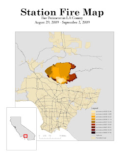
During the peak of its rage, the Station Fire covered multiple nearby communities, including La Canada Flintridge, Glendale, Acton, Le Crescenta, Littlerock, Altadena, and several neighborhoods within the City of Los Angeles. The slopes of Mount Wilson were also affected, as well as the areas around the Angeles Crest Highway. On my map above, the fire is depicted in various shades of orange and red. The initiation point of the wildfire, near the U.S. Forest Service ranger station in the Angeles National Forest, is displayed as a light orange spot. As the perimeter of the fire widens, the color darkens to a deep red. The legend displays the shades of colors that represent the area of the fire at a specific time on a specific day. This map displays the path of the fire between August 29th and September 2nd of 2009.
For my theme, I chose to display the populated areas of the Los Angeles County behind the shaded area of the fire. Also displayed are the major highways of the Los Angeles County. My thematic map shows how the fire spread geographically in comparison to the areas that were populated or used by people. It is evident that the fire lingered along the outer edges of the city while spreading deeply into the forest. The fire also managed to cross one major highway: the Angeles Crest Highway, which is mentioned earlier. From observations such as these, predictions or conclusions can be drawn. Perhaps the reason for the fire's path was because firefighters concentrated on preventing the flames from reaching deeper into the city and potentially causing expensive damage. Maybe the forest provided trees and materials to better fuel the fire. Comparing the path of the flames to the surrounding populated areas can reveal much information about the the fire.
This assignment demonstrates the many uses of thematic maps. During the fire, firefighters and newscasters alike used similar maps to track its movement. In addition, such maps provide different perspectives from which the data may be represented, and may therefore lead to revelations or insights about the event itself. Specifically, analysis can be performed to examine how the surrounding areas are affected by the phenomenon. Through such analysis, predictions may be made to help deal with similar problems. Thematic maps can assist us in making better decisions and taking smarter actions to benefit the community.
2009 California wildfires. Wikipedia. Web. 25 May 2010. http://en.wikipedia.org/wiki/2009_California_wildfires.
Mapshare. Web. 20 May 2010. http://gis.ats.ucla.edu//Mapshare/Default.cfm.
The National Map Seamless Server. Web. 20 May 2010. http://gis.lacounty.gov/eGIS/.
"Station Fire." CAL Fire. Web. 25 May 2010. http://cdfdata.fire.ca.gov/incidents/incidents_details_info?incident_id=377
Weikel, Dan (4 September 2009). "Angeles Crest Highway closed indefinitely because of fire". Los Angeles Times, 5 September 2009. Web. 25 May 2010. http://latimesblogs.latimes.com/lanow/2009/09/angeles-crest-highway-closed-indefinitely-because-of-fire.html.
14 May 2010
Lab 6: Digital Elevation Models
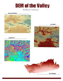
The maps above are the Digital Elevation Models, or DEMs, for an area of land in the northern part of the Los Angeles County. I chose this area because I grew up in the San Fernando Valley. Mountains are visible from my house, and these varying elevation levels make this part of the land ideal for DEMs. The topography of the area is portrayed on the map as ragged peaks in the northern half of the map and flat terrain (of the city) that lies below. The hillshade map shows a shaded relief model of my area, with the blue color signifying higher elevation. The slope map shows the degree of steepness in my map and the aspect map shows the direction that the area faces. To make the slope and aspect maps, I needed to convert the z-coordinate (the height) from meters to decimal degrees so that it would correspond to the the decimal degree measurements of the area of the map. The extent of my area is as follows:
top: 34.502°
left: -118.716°
right: -118.265°
bottom: 34.192°
The location lies within the UTM zone 11 and the spatial reference that I used was the GCS North American 1983.
10 May 2010
Lab 5: Map Projections
Map projections are crucial for geographical analysis. They allow easy interpretation of real world data by converting three dimensional information into comprehensible two dimensional models. Map projections generally fall into three categories: conformal, equal area, and equidistant. Conformal map projections conserve angles at the local level. Equal area map projections preserve the areas of geographical features, as its name suggests. Lastly, equidistant map projections preserve distances relative to the standard point of projection. All map projections distort the actual image of the map, so it is necessary to determine which projection best suits the purpose of the map. From this exercise, it is easy to see the distortions from the varying measurements of the distance between Washington, D.C. to Kabul, Afghanistan.
As stated earlier, conformal map projections conserve angles. Examples of conformal map projections include the Gall Stereographic projection and the Mercator projection. Projections such as these are useful for many purposes in real life analysis. Because angles are preserved, procedures that possibly require geometrical calculations or data angle manipulations are made easier. However, the preservation of angles results to the altering of shapes and sizes of map features. In both of my examples, you can see that the the continent of Antarctica is much larger relative to the other continents of the Earth. This exaggeration is due to the fact that it is furthest from the point of projection, and therefore holds the most distortion.
As a result, other projections are used if area is needed to be preserved. For instance, equal area projections like the Bonne projection and the Cylindrical Equal Area projection are useful for visualizing the sizes of objects relative to their surroundings. These maps can be used to compare the sizes of different continents or different oceans. However, shapes of the geographical features become altered using this type of projection. For instance, the Cylindrical Equal Area projection stretches the shapes horizontally, while the Bonne projection curves everything toward the north pole. Equal area maps projections should be avoided when an accurate representation of shapes is necessary.
For equidistant map projections, distance is preserved. This method of projection is best suited for this lab because we are measuring the distance between Washington, D.C. and Kabul, Afghanistan. Nevertheless, equidistant projections have distortions as well, especially along measurements that do not line up along the point of projection. These distortions are visible when comparing my two equidistant maps. The distances between Washington D.C. and Kabul differ rather significantly (a difference of approximately 2,000 miles) because they are projected along different lines. It is important to project the map closest to the area that you are examining to eliminate potential errors.
05 May 2010
Lab 4: GIS Data Models
My first experience with ArcGIS was filled with many challenges and frustrations. Perhaps what irked me at first was seeing that the tutorial consisted of a grand total of 58 pages. The list of instructions seemed endless to me as I followed each specific detail with care, fearing that if I missed one single detail, I would have to redo the entire lab. Especially considering the fact that I was completely unfamiliar with the program, making a mistake would be like stranding myself on an island in the middle of a sea of unknowns. However, I managed to work my way through the tutorial without any major problems. I gratefully admit that the actual instructions were crystal clear, complete with pictures and screen-shots. The comprehensiveness of the tutorial makes up for its length.
The bulk of the material of the ArcGIS tutorial seemed to be meant for familiarizing me with the basics of the systems. Much of the procedures involved learning to switch between the different layers and utilize the many available tools like scales or legends. Despite how time consuming the process was, I expect that ArcGIS will be an incredibly useful tool to me once I know how to use it effectively. With the many different functions that it performs, ArcGIS enables the presentation of data on a whole new level. Tables can be made and combined and values can be easily manipulated. Maps are easily constructed with multiple layers to compare and contrast data. The program implements all significant aspects of geography.
ArcGIS is a useful tool when trying to organize and visualize data. However, the complexity of the program may prove to be a pitfall. Relating to my own experiences, I am sure that many people do not find the whole tutorial process entirely enjoyable. Considering that the majority of human beings lack the patience to find reading instruction manuals pleasurable, I doubt that the general public will willingly sit through a 58-page ArcGIS tutorial session. In addition, many of the tasks are tedious when learning the basics. Although it does hold many opportunities, the program alienates many people with the inconvenience of having to learn how to use it.
Furthermore, a program as powerful as ArcGIS is not useful to everyone. Because most people do not need to perform such extensive analysis or research of mappable data, ArcGIS would not be a program to invest in. As a result, other than the government and few private firms, a small number would actively use ArcGIS. Therefore, very few people would have access to the exclusive program.
15 April 2010
Lab 3: Neogeography
View California Architectural Sights in a larger map
As a civil engineering major, I take great interest in architectural structures. California is home to many. I created a mashup that maps several of the major architectural structures in this state, creating a tool that architecture enthusiasts, like I, can use to further expand on our interests. The map includes a variety of bridges, buildings, and other structures. The icons each include a short description of the sight, as well as a photo or a short video.
By combining different elements and forms of media with geographic material, this map demonstrates the very essence of neogeography. Neogeography, meaning "new geography," involves the sharing of geographic data and the interaction that mashups enable. People use and compile their own maps, creating a geography that is centered on the user. This wide-scale interaction forms larger communities in which the possibility of generating many new ideas increases. Because it is easy to use, professionals and amateurs alike can share their maps, and geography becomes easier to teach. In addition, neogeography allows individuals to give perspective to raw geographic data.
However, despite its many advantages, neogeography has pitfalls as well. The convenience of producing maps causes the credibility of all information to be questionable. It becomes incredible easy and common for incorrect or unreliable information to be relayed. The internet also permits access to all information. Many have argued that tools such as Google Maps and other geographic programs cause an invasion of privacy because cameras or satellite images have the potential of recording peoples' lives. To this day, the invasive nature of the developing technology of neogeography still remains a delicate issue. Nevertheless, neogeography is largely responsible for spreading the practice of geography, developing an innovative and interactive method to approaching spatial data.
14 April 2010
Lab 2: Topography
1. The name of the quadrangle is Beverly Hills.
2. The names of adjacent quadrangle are Canoga Park, Van Nuys, Burbank, Topanga, Hollywood, Venice, and Inglewood.
3. The first quadrangle was first created in 1966.
4. The North American Datum of 1927 (horizontal) and the North American Datum of 1983 (vertical) were used to create this map.
5. The scale of this map was 1:24000.
6. Scale conversions:
a) 5 centimeters on the map is approximately equivalent to 1200 meters on the ground.
b) 5 inches on the map is approximately equivalent to 1.89 miles on the ground.
c) 1 mile on the ground is approximately equivalent to 2.64 inches on the map.
d) 3 kilometers on the ground is approximately equivalent to 12.50 centimeters on the map.
7. The contour interval on the map is 20 feet.
8. The approximate geographic coordinates for:
a) the Public Affairs Building is N 34˚04'30", W 118˚26'10" or (34.08˚, -118.44˚)
b) the tip of the Santa Monica Pier is N 34˚00'25", W 118˚30'0" or (34.01˚, -118.50˚)
c) the Upper Franklin Canyon Reservoir is N 34˚07'25", W 118˚24'28" or (34.12˚, 118.41˚)
9. The approximate elevation of:
a) the Greystone Mansion is about 560 feet or 170.69 meters
b) the Woodland Cemetery is about 145 feet or 44.20 meters
c) the Crestwood Hills Park is about 1050 feet or 320.04 meters
10. The UTM zone of the map is zone 11.
11. The UTM coordinates for the lower left corner of the map are 3763000m N, 372000m E.
12. There are 1000000 square meters contained within each square of the UTM grid lines.
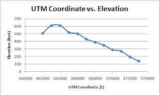
13. Elevation Profile from West to East.
14. The magnetic declination is 14.8 degrees east.
15. Water flows north in the intermittent stream between the 405 freeway and Stone Canyon.
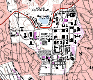
16. UCLA
2. The names of adjacent quadrangle are Canoga Park, Van Nuys, Burbank, Topanga, Hollywood, Venice, and Inglewood.
3. The first quadrangle was first created in 1966.
4. The North American Datum of 1927 (horizontal) and the North American Datum of 1983 (vertical) were used to create this map.
5. The scale of this map was 1:24000.
6. Scale conversions:
a) 5 centimeters on the map is approximately equivalent to 1200 meters on the ground.
b) 5 inches on the map is approximately equivalent to 1.89 miles on the ground.
c) 1 mile on the ground is approximately equivalent to 2.64 inches on the map.
d) 3 kilometers on the ground is approximately equivalent to 12.50 centimeters on the map.
7. The contour interval on the map is 20 feet.
8. The approximate geographic coordinates for:
a) the Public Affairs Building is N 34˚04'30", W 118˚26'10" or (34.08˚, -118.44˚)
b) the tip of the Santa Monica Pier is N 34˚00'25", W 118˚30'0" or (34.01˚, -118.50˚)
c) the Upper Franklin Canyon Reservoir is N 34˚07'25", W 118˚24'28" or (34.12˚, 118.41˚)
9. The approximate elevation of:
a) the Greystone Mansion is about 560 feet or 170.69 meters
b) the Woodland Cemetery is about 145 feet or 44.20 meters
c) the Crestwood Hills Park is about 1050 feet or 320.04 meters
10. The UTM zone of the map is zone 11.
11. The UTM coordinates for the lower left corner of the map are 3763000m N, 372000m E.
12. There are 1000000 square meters contained within each square of the UTM grid lines.
13. Elevation Profile from West to East.
UTM coordinate | Elevation |
362000 E | 510 |
363000 E | 610 |
364000 E | 610 |
365000 E | 520 |
366000 E | 502 |
367000 E | 430 |
368000 E | 390 |
369000 E | 350 |
370000 E | 290 |
371000 E | 270 |
372000 E | 194 |
373000 E | 140 |
14. The magnetic declination is 14.8 degrees east.
15. Water flows north in the intermittent stream between the 405 freeway and Stone Canyon.
16. UCLA
31 March 2010
Lab 1: Maps
Map of UFO Hot Spots
This map, attained from the website http://strangemaps.wordpress.com/2007/11/01/, shows the distribution of UFO sitings in the United States of America. It is color coordinated from varying shades of yellow to red that represent the least amount of UFO sitings to the greatest amount. I found it interesting that the locations with the most UFO sitings were in less-populated areas, generally in the Mid-west. This may reflect a connection between superstitious belief and location. The residents of the Midwest are generally believed to be less "exposed" and disconnected, seeing that they live away from urbanized cities, and therefore may turn to things like superstition and religion.
Map of Foreign Born People
This map shows the the distribution of foreign-born people that reside in the United States of America in 2004. The states are colored varying shades of green, displaying the percentage of immigrants that live within each state. I found it interesting that the center of the country was lightly colored to signify that it had the smallest foreign-born population. In contrast, the states along the East and West border, especially New York, Florida, and California, have the darkest color that suggests a greater foreign-born population. This phenomenon may result from the fact that the states along the coast of the Pacific and Atlantic Ocean are easier to access from other countries compared to those among the Midwest. As a result, more foreigners may move to these states because of convenience. The source of this map is the website: http://www.state.gov/cms_images/iccpr_survey_map.jpg.
As seen on the site http://www.bls.gov/lau/maps/twmcort.gif, this map is color coordinated quite morbidly to represent the unemployment rates of the United States. I found that this map also illustrates a distinction between the less-populated Mid-west and the rest of the country. The smaller affect of the economic crises on the Mid-west may be because of the smaller ratios of workers to jobs in the area. In contrast, the west and the east are darker colored and suffer a more severe degree of unemployment. This result may be because the greater number of white-collared jobs available in urban areas outside the Midwest. As many companies collapse, a greater amount of people will lose their jobs.
Subscribe to:
Posts (Atom)